Dialpad iOS Calling Redesign
A full redesign of Dialpad's iOS calling experience — shipped to GA
I was the sole designer on this project, leading design end-to-end from discovery through GA. Engineering had already been rewriting the underlying call stack when I joined the effort — my role was to own the full design layer: defining the UX direction, building the visual model, aligning with product and engineering, and iterating with real customers until it was ready to ship.
I collaborated closely with a desktop designer to share patterns and reuse components from our design system, and leaned on peers for feedback throughout. The new experience shipped in Dialpad iOS 36.0, eliminating 20,000+ lines of legacy code and setting a new standard for mobile design and user experience quality across the product — one that future features could build on without starting from scratch.
A calling experience held together with patches
Years of incremental fixes created a UI that was painful to use and impossible to maintain. The problems weren't cosmetic — they were structural.
- ▪ Unreliable and fragmented — high call failure rates, brittle codebase, and a UX that varied unpredictably across states.
- ▪ Missing critical capabilities — transfer, group calls, and supervisor flows were absent or broken on mobile, while desktop had them all.
- ▪ No room to grow — the existing architecture couldn't support AI features like real-time transcription or coaching at scale.
"When I'm on the go, I waste too much time trying to find basic call actions. It slows down my workflow and feels clunky compared to desktop."
Account Executive, Mid-Market customer"When I need to transfer or add someone fast, I panic because it takes too many taps."
Sales Manager, Enterprise customerProfessionals who can't afford friction on a call
Dialpad is a business communication platform for teams that depend on calls to get work done — where every extra tap has a cost.
| User type | Context | Key need |
|---|---|---|
| Sales reps & AEs | High call volumes, constant context-switching | Fast transfer, hold, add participants while multitasking |
| Support & contact center agents | Real-time customer conversations | Zero tolerance for errors on mute, hold, and transfer |
| Customer success managers | Relationship-focused calls | Quick access to context without disrupting the conversation |
| Small business owners | Dialpad is their primary phone system | Native reliability — not a workaround |
Understanding the gap before designing the solution
Before wireframing, I ran a structured discovery phase to map the actual experience and surface the right problems to solve first.
Desktop vs. Mobile gap analysis
Mapped all call states, controls, and critical flows across platforms. Found where mobile was missing features desktop users relied on daily — transfer flows, group call controls, supervisor actions.
End-to-end flow documentation
Collaborated with another designer to document key scenarios: Listen In, Transfer Call, Add a Caller, Keypad. Exposed inconsistencies and edge cases invisible when looking at individual screens.
Usage data from Amplitude
Analyzed interaction data to understand which actions users actually needed. The numbers directly shaped the design hierarchy — what goes primary, what stays secondary, and what's a discoverability problem vs. a value problem.
Cross-functional alignment
Aligned with PM, Engineering, and QA on scope and UX direction early. Defined success metrics before design began — combining experience, reliability, and engagement signals. We created a shared milestone doc to track design and development progress together, ensuring both sides were always in sync before moving to the next phase.
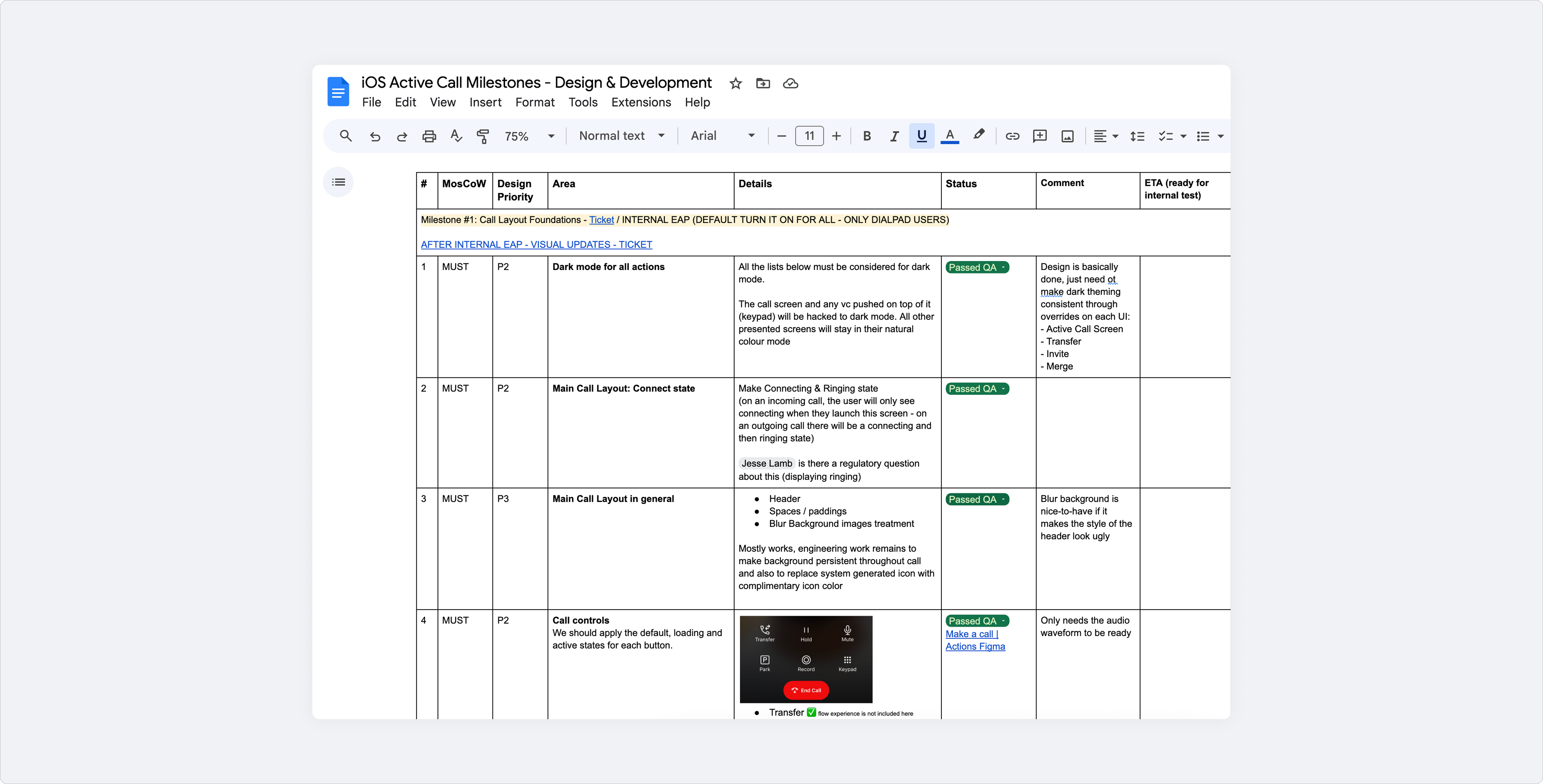
iOS Active Call — Design & Development Milestones doc
Early concept explorations
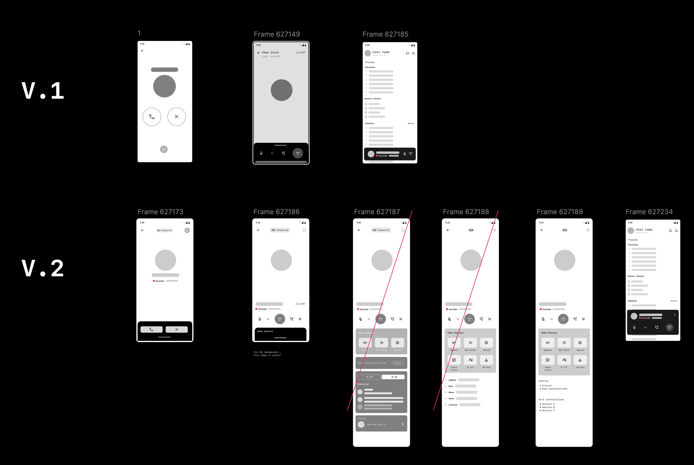
Before committing to a direction, I explored two layout concepts through interactive prototypes. These weren't final solutions — they were hypotheses to test different mental models for how call controls could be structured on mobile.
Concept 1 — Fluid gesture navigation
Concept 2 — Action-first, thumb-reach ergonomics
Legacy iOS data made the hierarchy clear: hang up and speaker were the most-used controls by far, while transfer and AI features were barely discoverable — used by fewer than 100 people. That directly informed what goes primary, what lives in a secondary drawer, and what needed a redesign to surface at all.
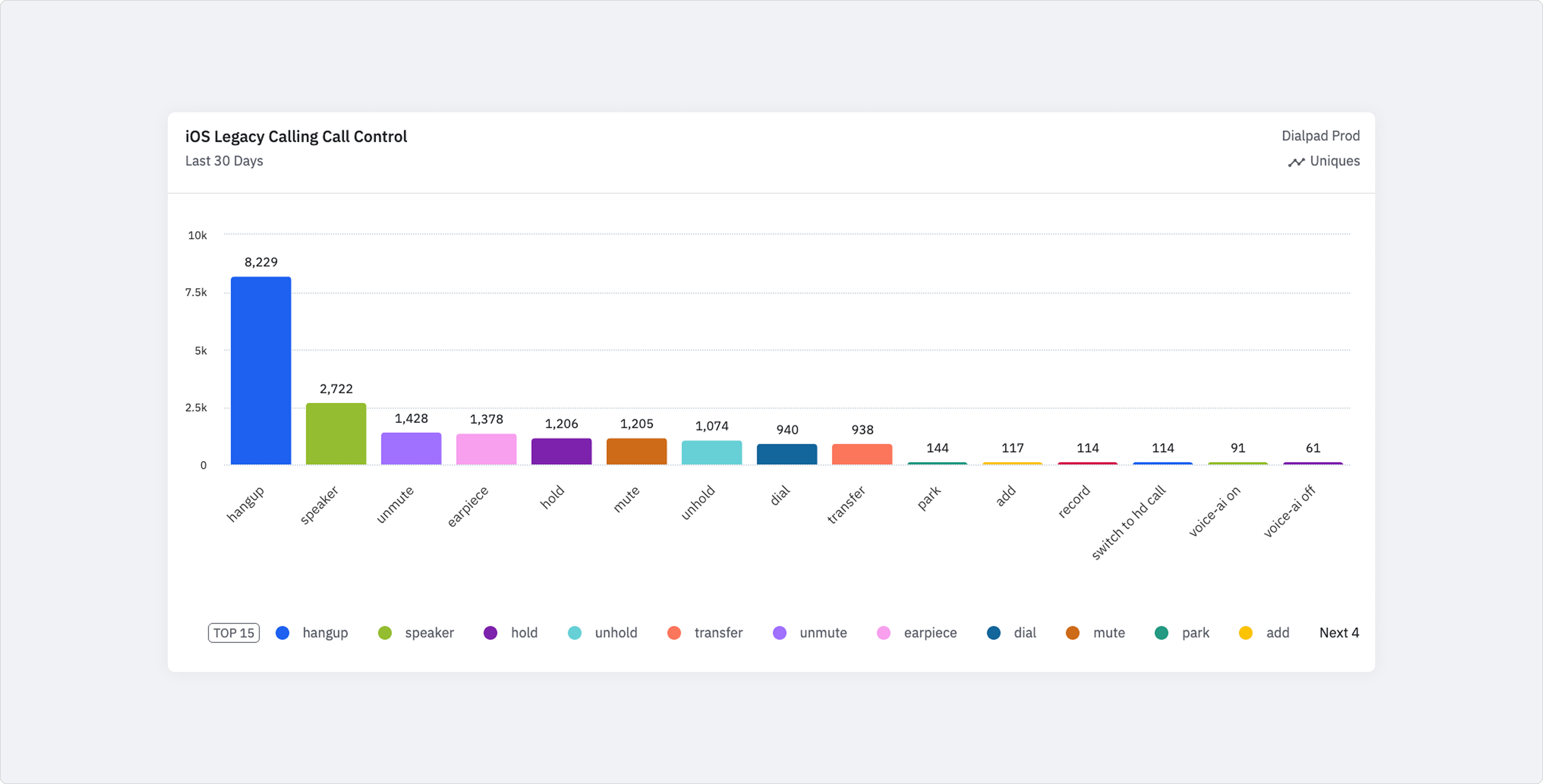
Legacy iOS call controls — Amplitude data
From static layout to dynamic, modular interface
The new layout needed to do more than fix what was broken today — it had to be flexible enough to support what was coming. Real-time transcript was already on the roadmap. More AI features would follow. The design had to be ready for all of it without starting from scratch each time.
- ▪ Dynamic, state-aware layout — the interface adapts to what's happening on the call rather than showing a fixed grid regardless of context.
- ▪ Modular by design — new features like live transcript and coaching can be added to existing surfaces without rebuilding the whole experience.
- ▪ iOS-native patterns as the foundation — respecting platform conventions so the experience feels immediately familiar, while bringing a clear Dialpad visual identity on top.
Layout structure and control hierarchy
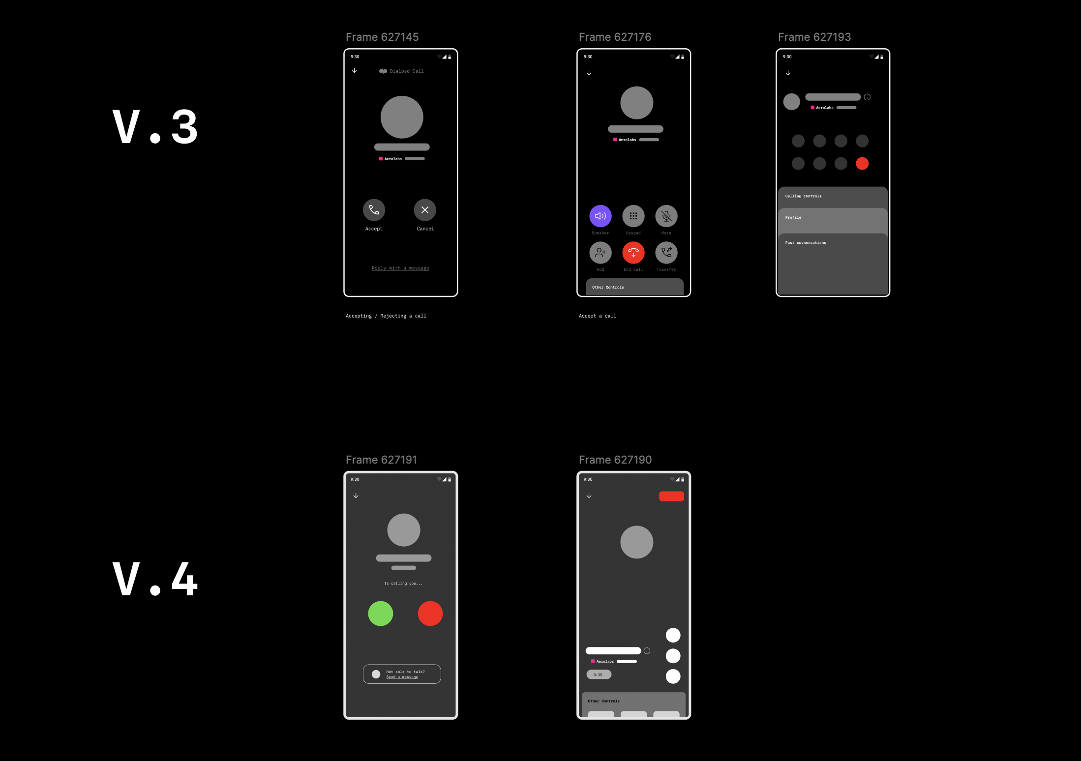
Secondary drawer and call state variations
Controls hierarchy first
Multiple layout geometries tested. Top 5 actions prioritized from usage data — reducing cognitive load under pressure.
Secondary actions stay accessible
Transfer, Add Caller, and Record moved to a consistent secondary layer — always findable in 2 taps, never cluttering the primary surface.
Gesture-based navigation
Evaluated swipe interactions and expandable drawers for secondary surfaces without interrupting an active call.
Dialtone alignment
Updated iconography, spacing, and visual weight to match Dialpad's design system — consistent with the desktop call bar shipped in parallel.
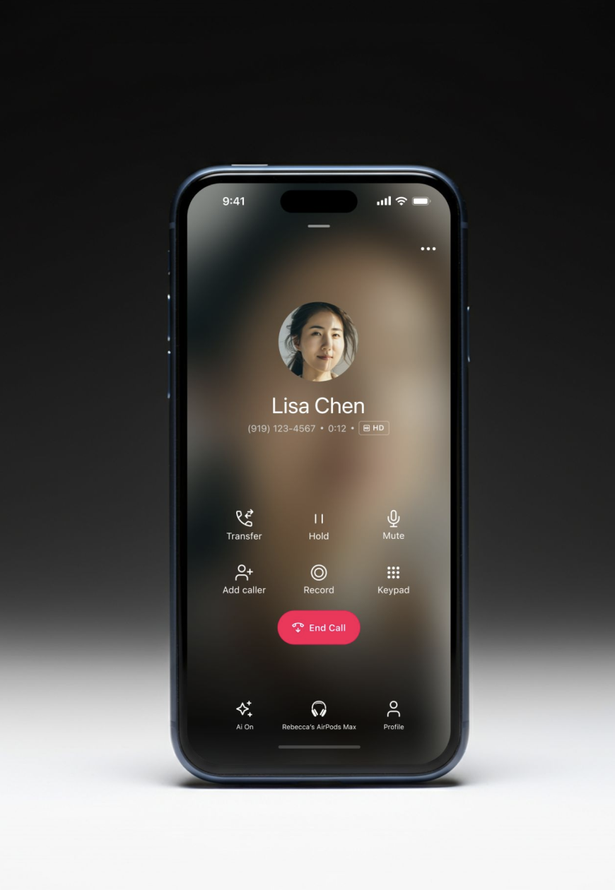
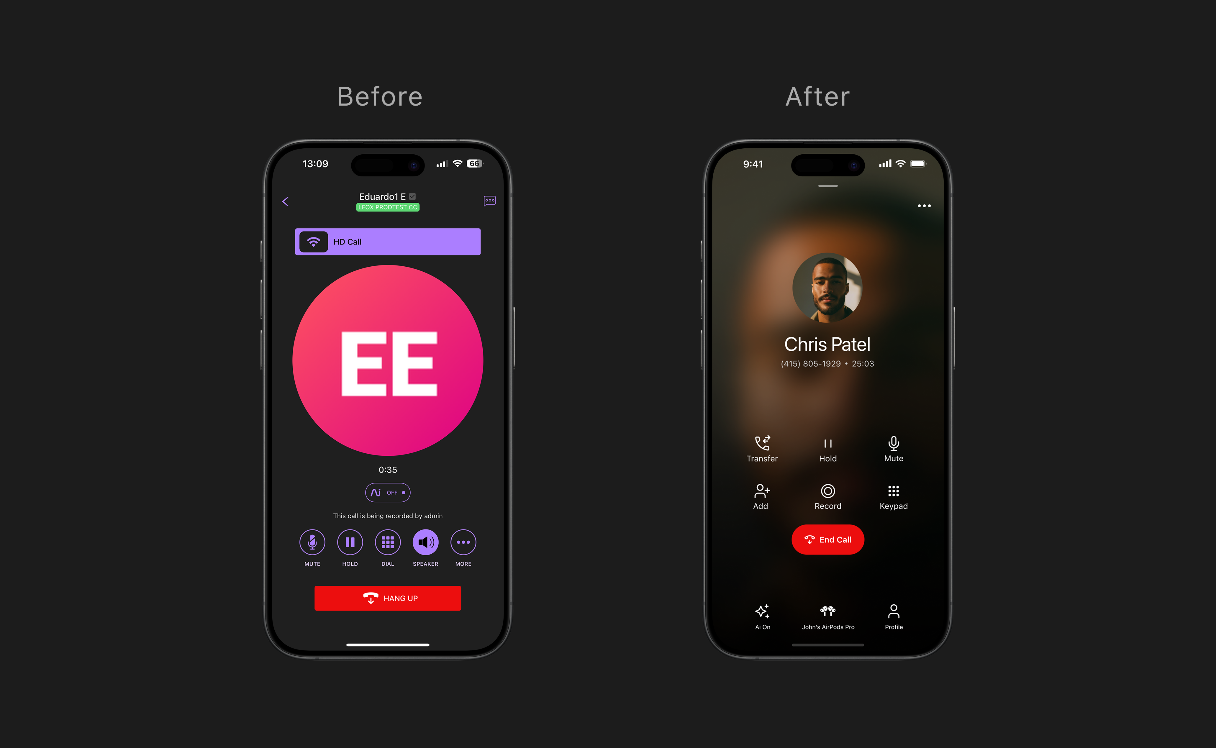
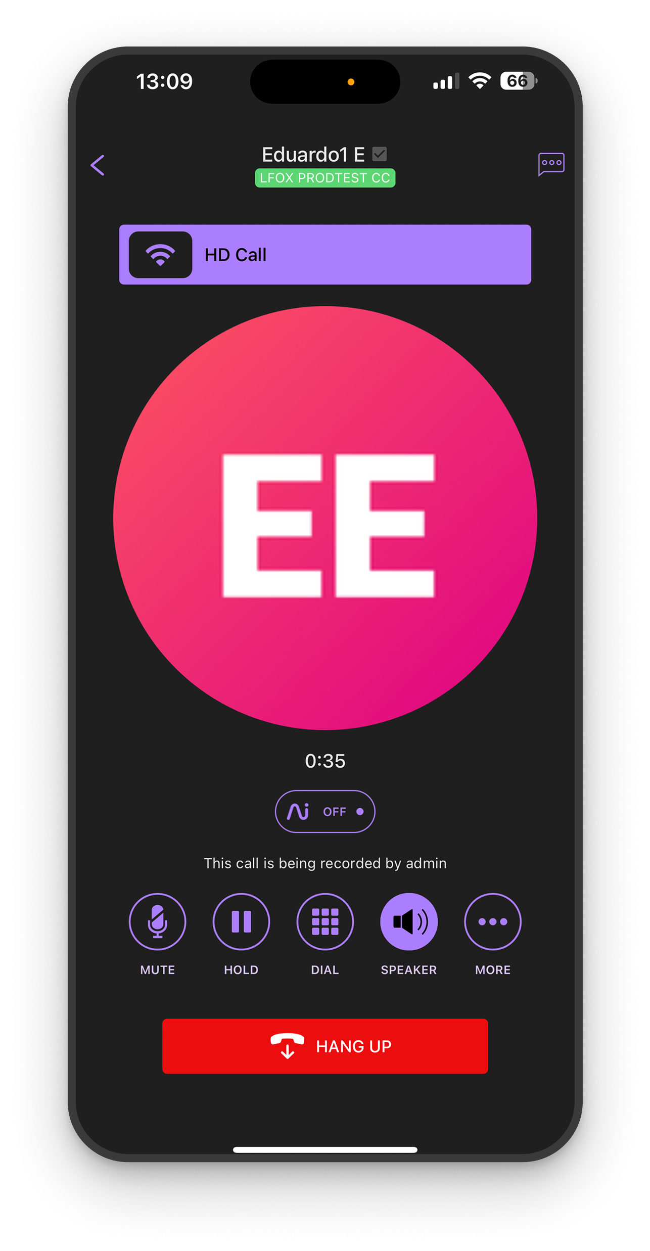
Final UI — active call screen, redesigned from the ground up
Bluetooth detection — custom audio routing UI replacing the generic iOS picker
The scenarios that drove the most design decisions
These are the moments where the legacy experience failed users hardest — and where the new design had the most to prove.
Answering and managing an active call
Primary controls immediately visible — no hunting. Hang up, mute, speaker, hold available one tap away regardless of call state.
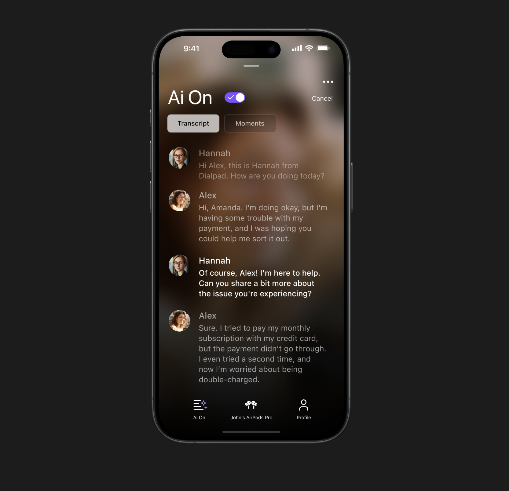
AI features on a call
The new design brings AI to the surface — live transcript, Moments capture, and an AI toggle users can control mid-call. Previously buried, these features are now a first-class part of the call experience.
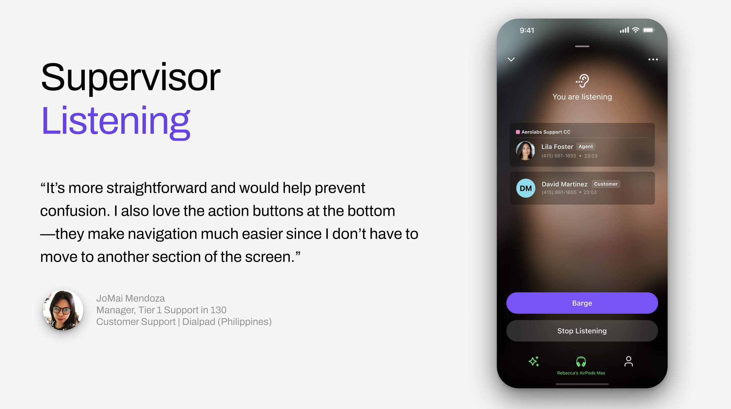
Supervisor calls
Rebuilt supervisor flows to match the new architecture — consistent entry points, clear hierarchy, and a listening state that surfaces the right actions without requiring navigation away from the call.
Move call here
Users can seamlessly transfer an active call from desktop to mobile — or vice versa — without dropping the conversation. A single tap hands the call off to the current device.
Tested early, iterated continuously
Validation wasn't a final gate — it was embedded throughout the process.
Internal EAP — December 2024
New experience made default for all Dialpad employees — real usage at scale before GA, catching edge cases under actual working conditions.
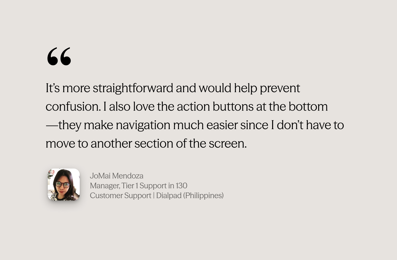
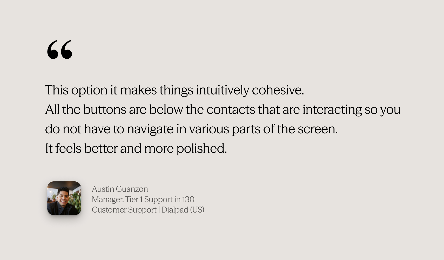
Usability testing with real customers
Tested with sales reps, support agents, and CSMs. Key finding: secondary action discoverability under pressure was harder than expected — led to layout refinements before GA.
Continuous metric monitoring
Tracked call rating trends, setup failure rates, and feature usage in Amplitude. Multiple rounds of iteration between EAP and GA based on data.
Adoption grew. Quality held. Legacy is gone.
97% of all iOS calls now run on the new async stack — 22.6M call setups in the last 30 days. Unique callers grew +25% since launch, and the quality data backs it up.
The new layout made previously buried actions reachable. Every key feature grew — and AI features appeared for the first time.
Transfer
+84%
15,258 → 28,124 users
Mute / Unmute
+125%
~22K → ~50K users
AI Transcript
6×
291 → 1,926 users
The project was presented at internal Dialpad design events and received strong positive feedback across the team. In August 2024, I was awarded the Team Choice Award by the Dialpad Design Team 💜 — recognized for driving impact, embracing design thinking, and going above and beyond.
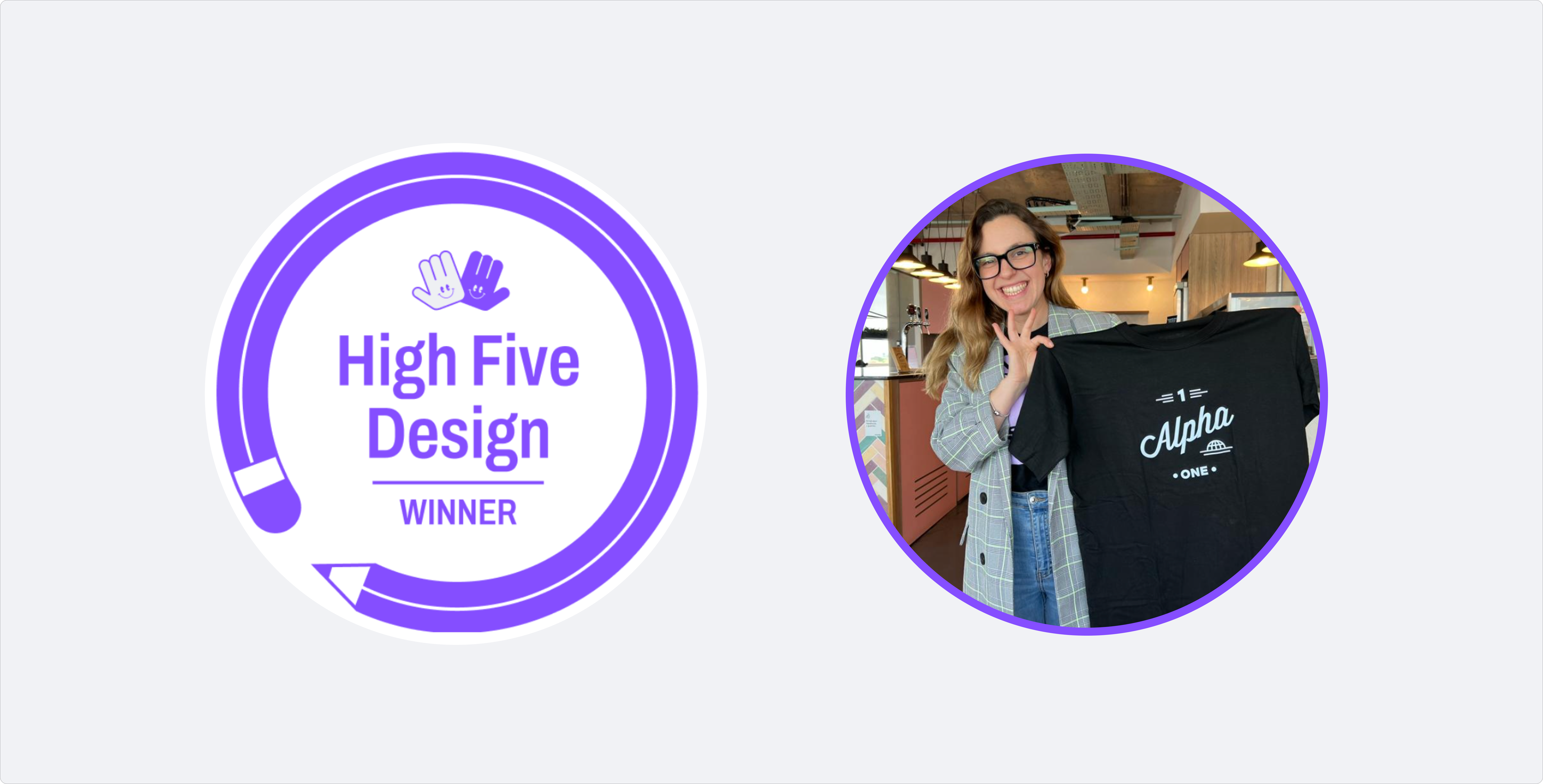
High Five Award — Team Choice · Dialpad Design Team · Aug 2024
What I learned
Think systemically, not screen by screen
The biggest design decisions weren't about individual screens — they were about the system. How states connect, how controls scale, how patterns hold across every call scenario. Designing at that level is what made the whole thing coherent.
Data shapes better decisions than intuition alone
Amplitude usage numbers directly determined the control hierarchy. Features with 68× growth after the redesign were ones nobody could find before — the data made that visible and the design made it fixable.
Alignment is a design output
Keeping engineering, product, and QA in sync across a complex, multi-phase delivery required the same clarity of thinking as the design itself. The new calling experience set the visual and interaction standard for mobile projects that followed.