Never miss what matters
Helping Dialpad users catch up on what they missed — fast
Catch Up started as an internal hackathon idea — a way to help mobile users quickly get through unread messages without losing context. I was the sole designer on the project, owning the full design process from initial concept through GA: defining the interaction model, building the visual design, specifying every edge case, and iterating with the team post-launch using real Amplitude data.
The hackathon entry was runner-up in the Customer Happiness category at the EPD Hackathon 2024 — and a few months later, it shipped to GA as a real feature used daily across the org.
Once you open it, you're committed — or you lose it
Mobile users at Dialpad — sales reps, support agents, managers on the go — were constantly returning to an inbox full of unread messages and missed calls. The existing experience gave them no way to triage or act efficiently. A broader notification overhaul was already in progress as a separate cross-platform initiative — Catch Up was designed as a focused, faster solution for the mobile triage problem specifically.
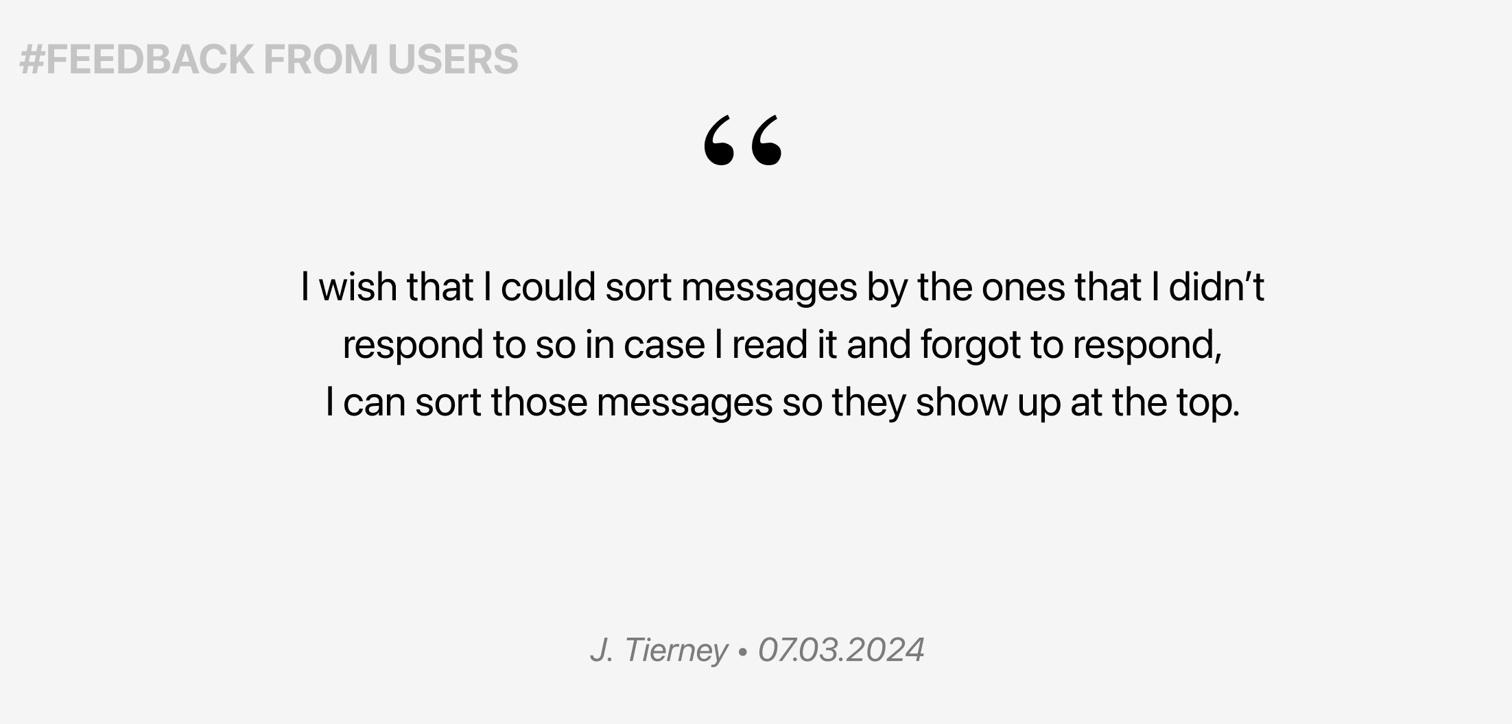
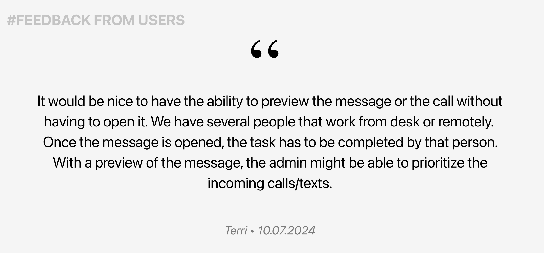
- ▪ No way to defer — once you opened a message, it was marked read. There was no way to flag it for later without losing it in the list.
- ▪ No priority signal — everything sorted by recency, with no way to know which messages needed urgent attention.
- ▪ No progress sense — users had no way to know how many items were left or feel like they were making progress.
Users away from their desk — but still in the loop
The feature was designed for users who work primarily from their phones — traveling between meetings, on the floor, or managing teams remotely. They don't have time to scroll through a full inbox, but they can't ignore it either.
From hackathon idea to shipped product — in weeks
The concept started at an internal hackathon — but the problem it solved was real. After the hackathon, the project was nominated for the Customer Happiness award and got C-Level sign-off to move forward. That greenlight turned a prototype into a full product — with proper scoping, engineering alignment, and a phased milestone plan.
Existing pattern analysis
Dialpad already had a way to mark messages as unread — but it required several taps, worked one conversation at a time, and wasn't discoverable. Users who wanted to "come back to this later" had no fast path to do it, especially on mobile.
Competitive review
Looked at how email clients, Slack, and other messaging apps handle triage — swiping patterns, snooze mechanics, and read/unread states to understand established mental models.
Scope definition with PM and Engineering
Ran a scoping session to separate the core experience from nice-to-haves. Defined Milestone 1 using MoSCoW prioritization — the must-haves were swipe interactions, a progress counter, and access from the home screen.
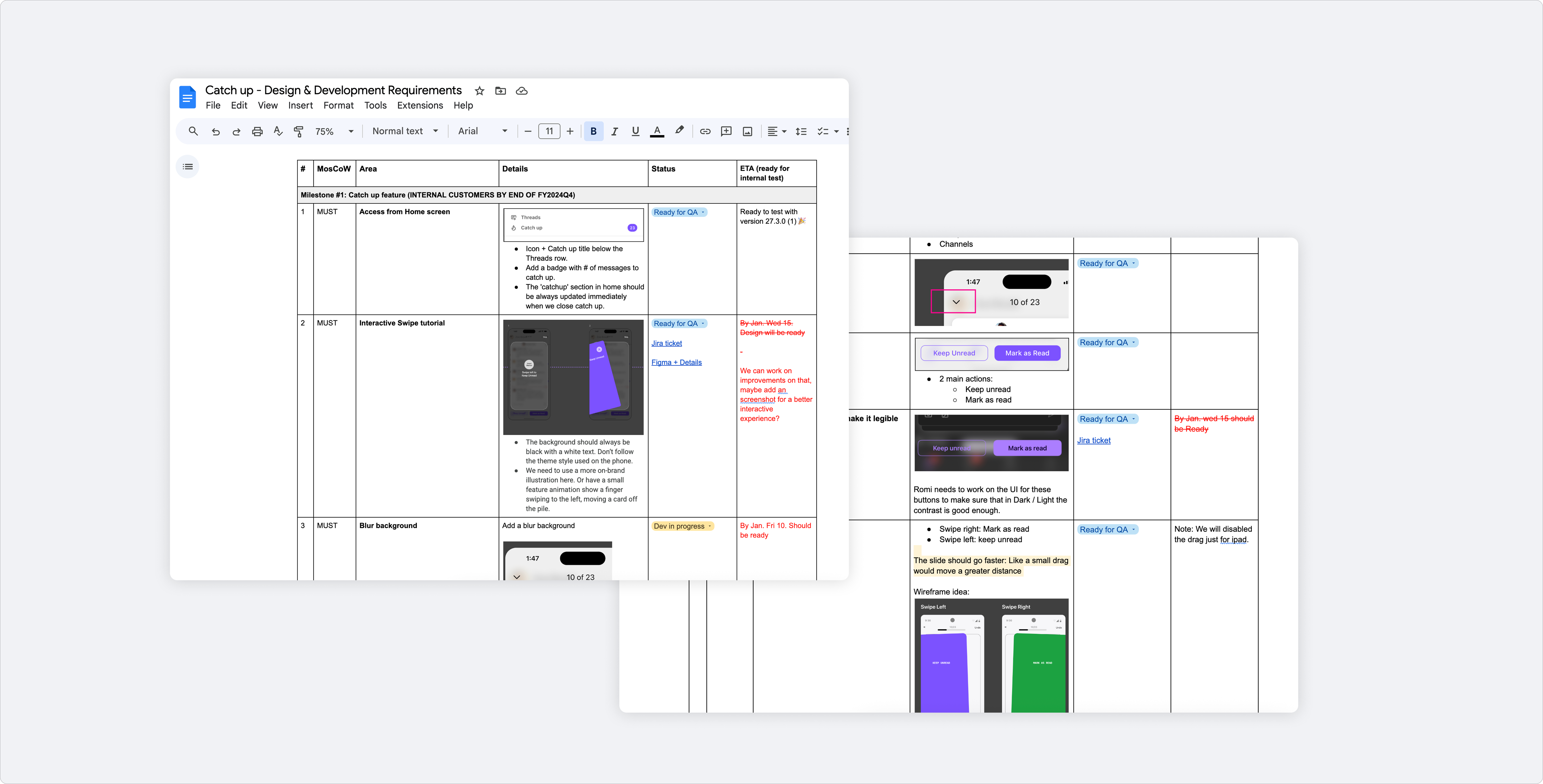
Documentation to align Product, Design & Engineering · MoSCoW framework
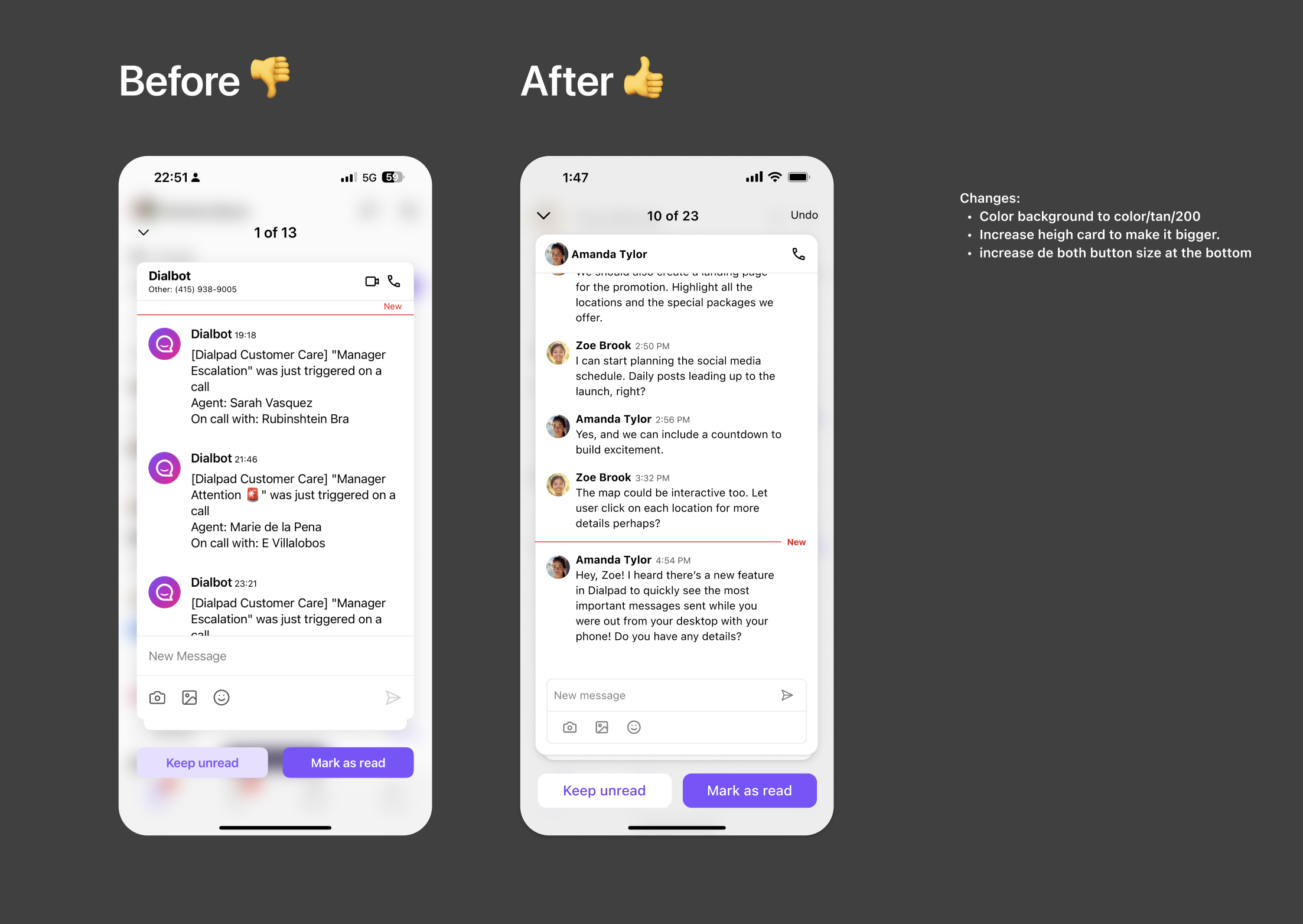
Building a gesture-first triage experience
The core design challenge was making a high-volume task feel light. Catch Up needed to feel fast, clear, and rewarding — not like more work. The interaction model centered on two gestures: swipe right to mark as read, swipe left to keep unread for later.
Key design decisions
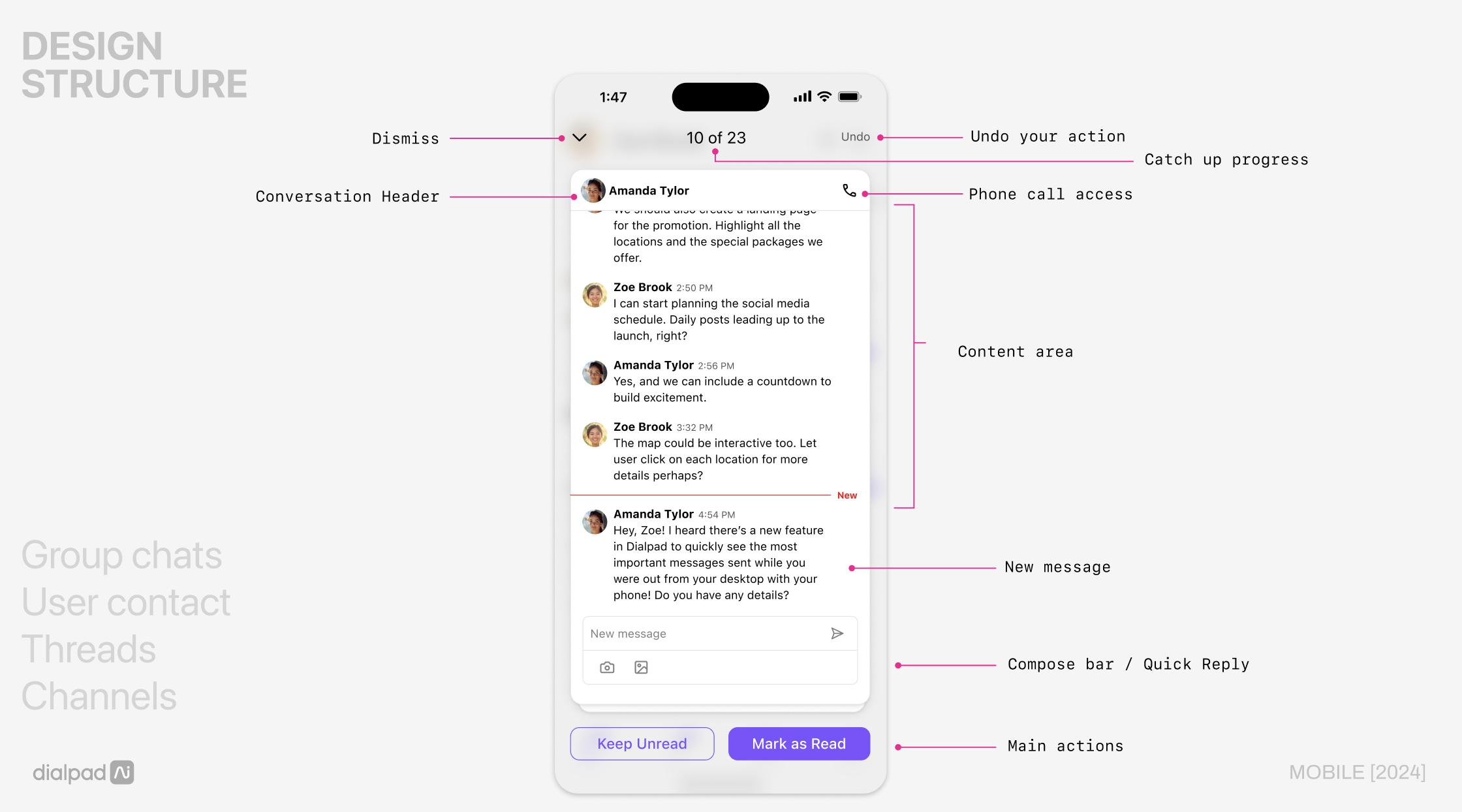
Every element in the screen had a job. Nothing was decorative.
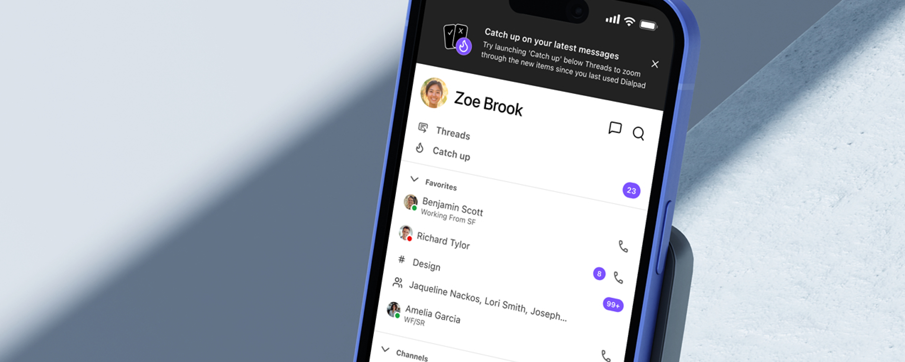
Entry from home screen
Catch Up lives right below Threads — visible from the first screen. No hunting required when you come back to the app.
Swipe gestures as primary action
Swipe right = mark as read. Swipe left = keep unread. Buttons exist for accessibility, but gestures are the main flow — fast and thumb-friendly.
Progress counter
"10 of 23" at the top. Gives users a sense of momentum and a clear end — making the inbox feel finite, not endless.
Done state with illustration
Custom illustrations by Magali Morales appear when users clear their Catch Up. A small reward that reinforces the feeling of completion.
Design structure — annotated UI with key interaction zones
Feature walkthrough — swipe interactions, progress counter, done state
Three flows that make the experience work
Entry & notification
Users access Catch Up directly from the home screen via a persistent entry point below Threads. A push notification nudges users back into the app when there are new items to review.
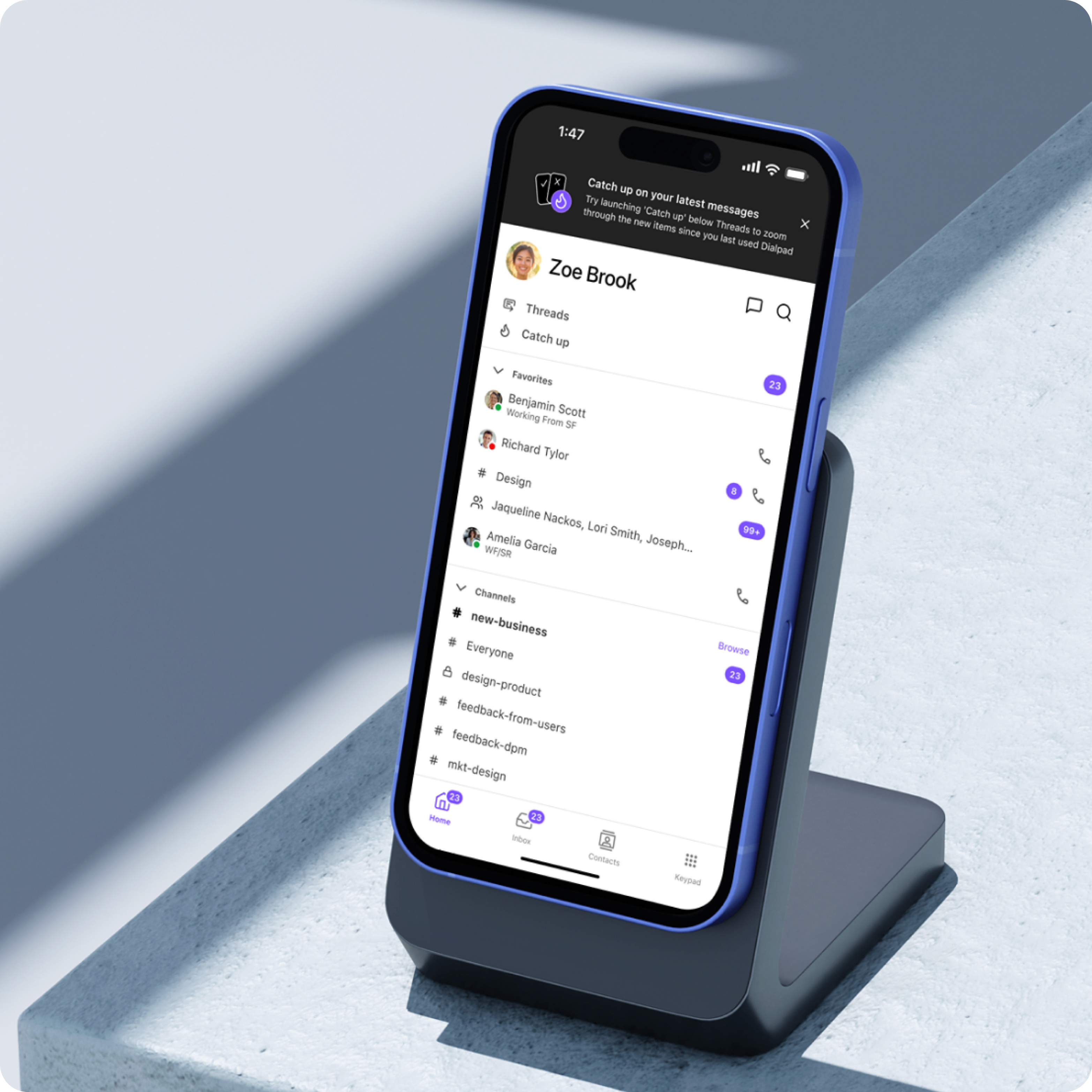
Catch Up feature discovery — notification design to drive awareness
Triage — swipe or tap
Each card shows the conversation with a quick-reply composer. Users swipe right to mark as read or swipe left to keep unread. Buttons provide the same actions for accessibility. An undo action is available for 3 seconds after each gesture.
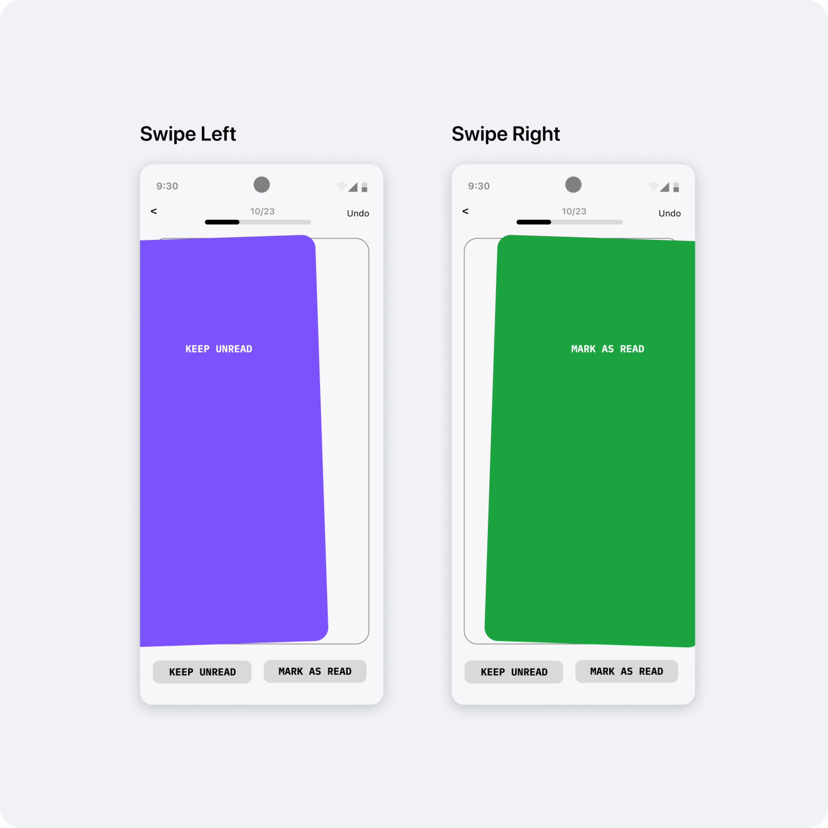
Swipe interaction — wireframe shared with engineering for implementation specs
Onboarding — interactive tutorial
First-time users see an interactive swipe tutorial on their first open. It teaches the gesture model in context, using the actual UI so there's no mismatch between the tutorial and the real experience.
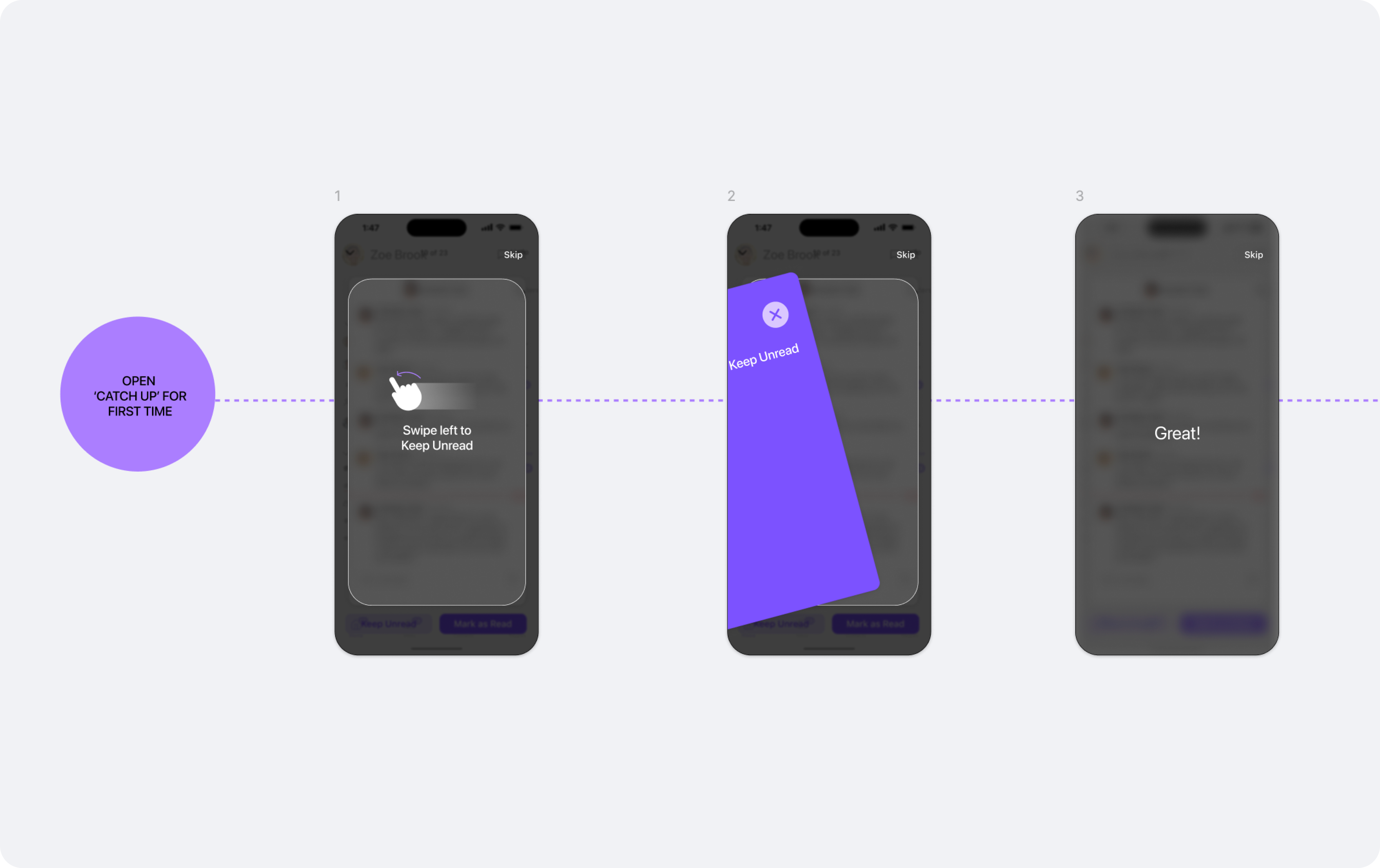
Onboarding sketch — early concept for an interactive tutorial to teach the gesture model on first use
Internal EAP first, then Amplitude-driven iteration
We launched Catch Up internally before releasing externally. This gave us real usage signal before GA — and real Amplitude data to iterate on.
Internal EAP — all Dialpad employees
Catch Up shipped to all Dialpad employees as the default experience before GA. Real usage at scale, catching edge cases under actual working conditions.
UI polish with development
Close collaboration with iOS engineering to refine button contrast for dark/light mode, tune swipe velocity, and tighten animation timing. Small details that made the experience feel native.
UI polish — button sizing, card background, and action bar refinements
Amplitude dashboard — built from scratch
Since Catch Up was a net-new feature, I defined the full event taxonomy and instrumentation plan, partnered with iOS engineering to implement, and built the tracking dashboard in Amplitude to monitor adoption from day one.
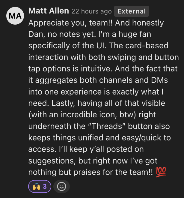
Strong launch. Clear next bets identified.
The feature launched successfully and was well received — 24K users in the first month. Post-launch data gave us a clear picture of what worked and where the next iteration needs to focus.
Internal customer feedback — EAP

Post-launch data shaped two clear iterations. Both came directly from user signal — one from feedback, one from usage patterns.
User-controlled prioritization
We had pre-defined which messages appeared in Catch Up and in what order — DMs first, then channels, then threads. Post-launch, users pushed back: they wanted to decide that themselves. We designed a lightweight settings screen to give them that control, validating the demand before committing it to the core experience.
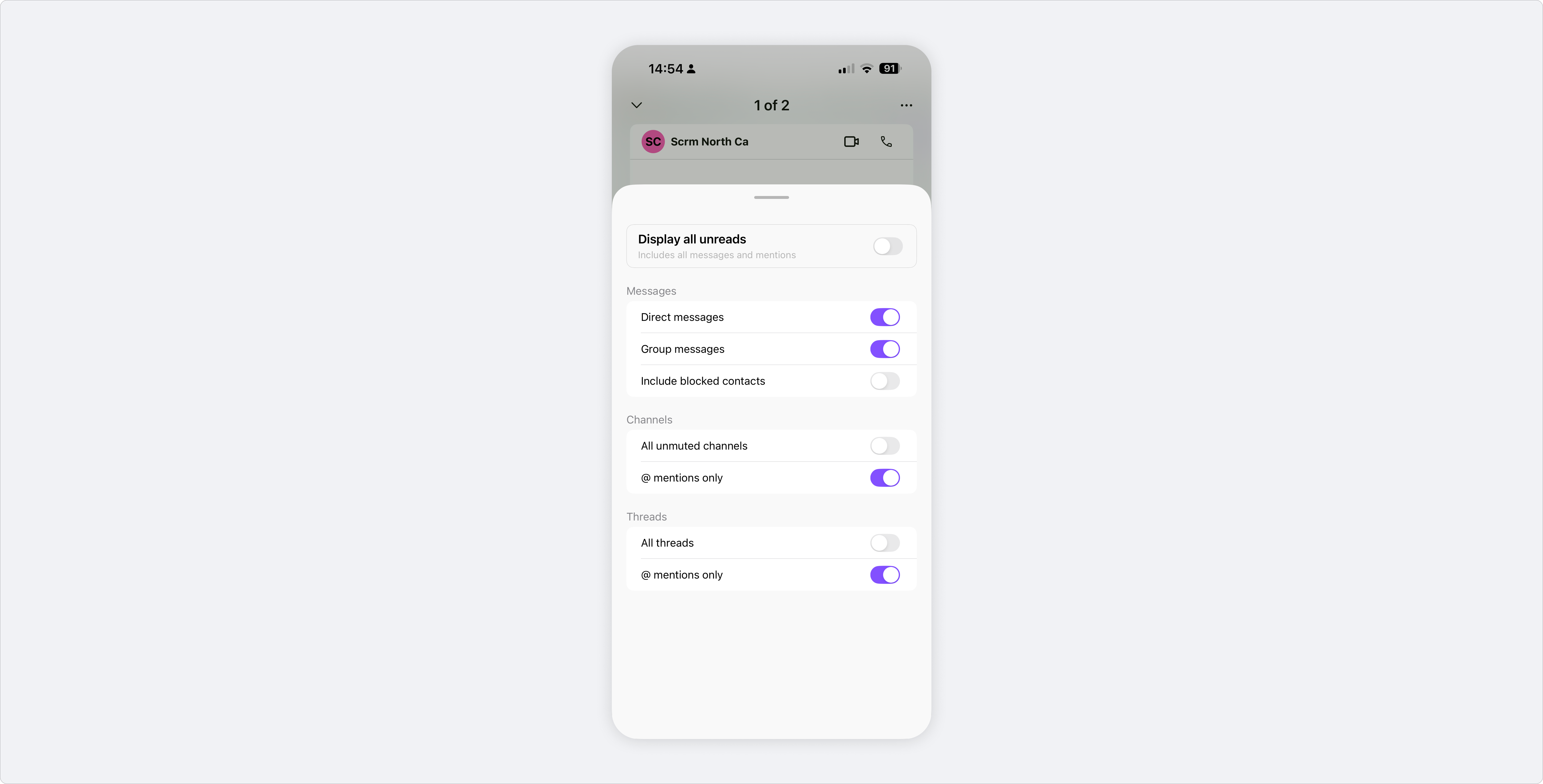
Catch Up settings — filter by message type to prioritize what matters
Brand & delight
Dialpad was in the middle of a rebrand, and we saw an opportunity to bring new brand elements into the product. We partnered with Marketing to commission custom illustrations by Magali Morales for the done state — turning task completion into a moment of reward and personality. The collaboration opened an ongoing working relationship with the Marketing team around brand expression in product.
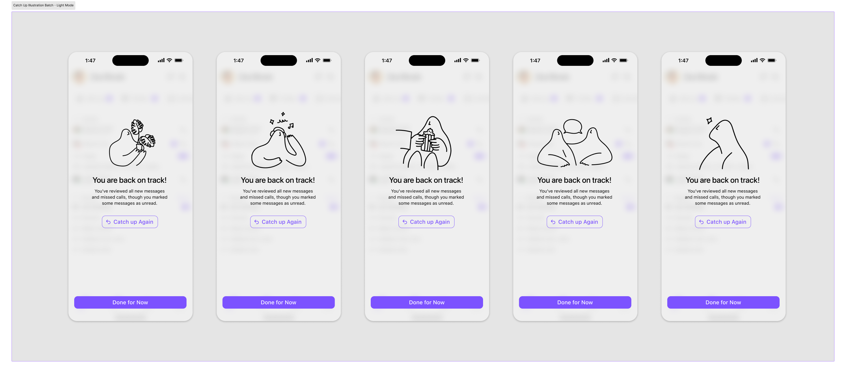
Done state illustrations — five variants by Magali Morales
What I learned
Ship lean, learn fast
Launching as an internal EAP before GA meant we had real usage data before committing to the final design. Post-launch metrics revealed gaps we couldn't have predicted in design reviews — data resolved what intuition couldn't, and gave us a clear roadmap for the next iteration.
Defining your own analytics is part of the design process
Building the Amplitude dashboard from scratch — defining the event taxonomy, instrumenting with engineering, building funnels — was as much a design decision as any visual choice. If you don't define what success looks like before launch, you can't learn from it after.
Small moments of delight have disproportionate impact
The end-state illustrations were a last-minute addition — but they became one of the most talked-about parts of the feature. Emotional reward at task completion drives retention in a way that functional UX alone doesn't.