Caller ID control — know who you're calling as, every time
From a confusing dropdown to a dialer that gives you real control
The Dialpad mobile keypad had a foundational problem: identity and Caller ID lived in a single combined control, and users couldn't confidently tell which number they were calling from. I was the sole designer on the mobile team for this project — owning the end-to-end design across iOS, Android, and tablets, working closely with engineering and product to separate the two concepts, align the experience with desktop, and resolve a chain of production bugs that impacted VIP customers.
Users didn't know which number they were calling from — and it had real consequences
On mobile, identity (who you're calling as) and Caller ID (which number is shown to the recipient) were combined into a single dropdown. On desktop, they were always separate controls. That gap created four concrete problems:
- ▪ Identity confusion — users with multiple lines couldn't clearly tell which number would be used when placing a call.
- ▪ Broken call history — calls placed with the wrong Caller ID were logged under the wrong identity. Users couldn't track conversations or find past calls, because the same contact could appear under multiple numbers depending on which line was accidentally selected.
- ▪ Spam risk — calling from the wrong number showed up as spam to recipients, damaging trust with customers before the call even started.
- ▪ Drop-off before the call — friction in the selection flow was enough to stop users from completing calls.
"Every time I make an outbound call I show up as spam."
"Dialpad seems to push me to use my personal line… I have to double and triple check to MAKE SURE I call them from the correct outbound number."
"I wish our customers could see my caller ID as Trugreen, so they wouldn't think I'm spam."
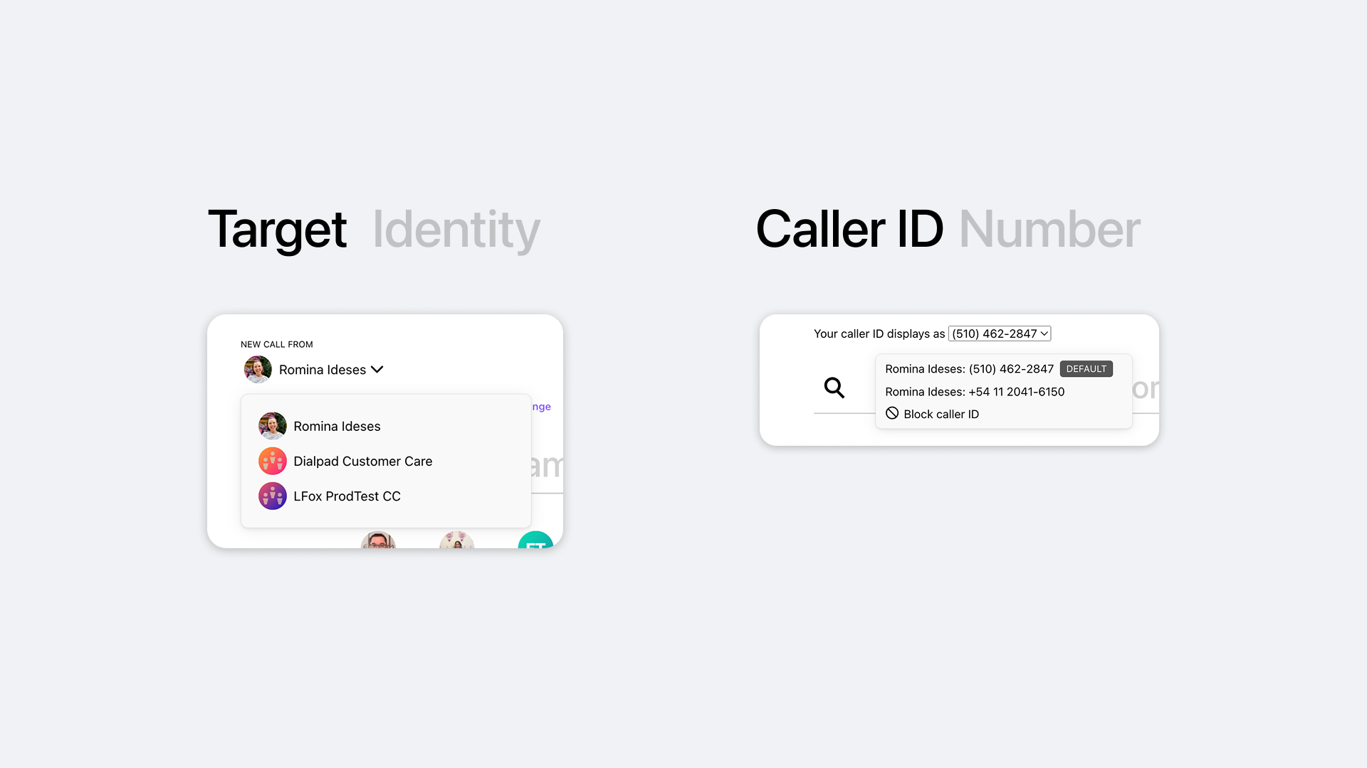
Desktop — Target Identity and Caller ID already separated into two distinct controls
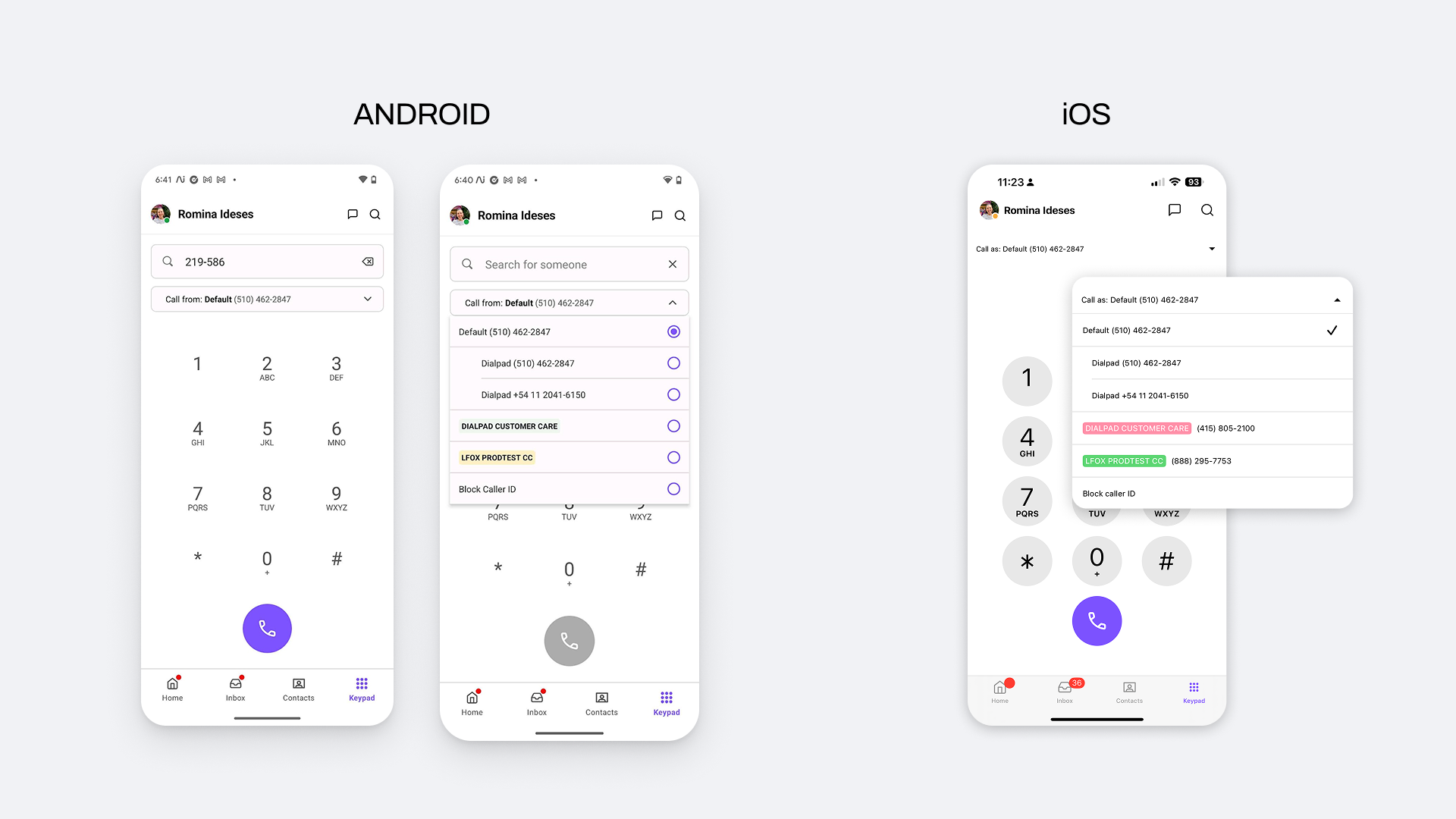
Mobile (Android + iOS) — identity and number merged into one dropdown, making it hard to know which Caller ID would be used
Users who manage multiple identities from their phone
The redesign primarily affects users making high-volume calls or managing multiple lines in professional contexts. Insights came from customer support tickets and a gap analysis between desktop and mobile behavior.
Finding the right pattern through iteration
Before committing to the dual-selector, I explored three layout directions — evaluating how each handled identity switching, Caller ID visibility, and the overall dialing flow. The goal was to find the option that added the most clarity without adding complexity.
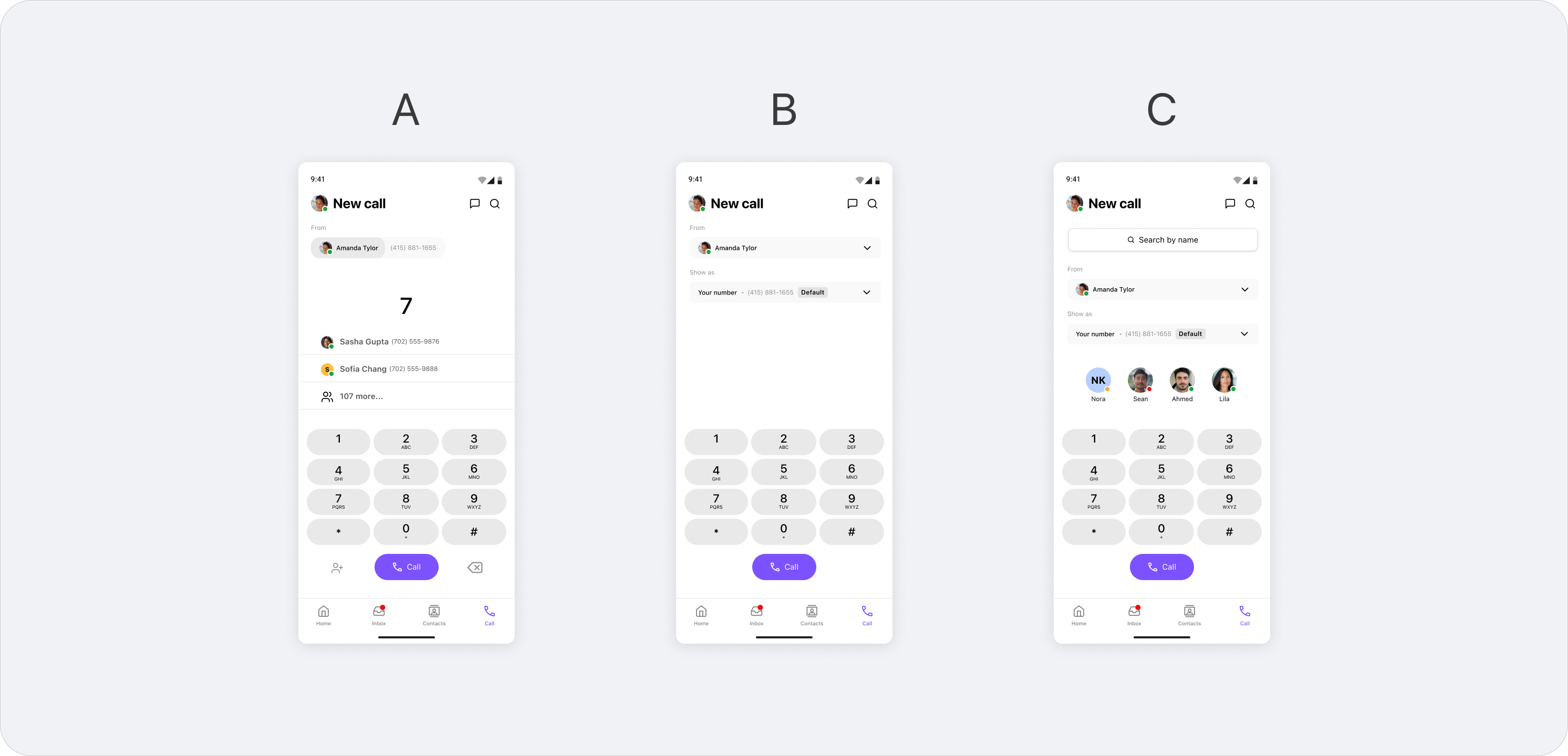
Three layout directions: A — minimal with recent contacts, B — inline dual selector, C — search + avatar row
Option A — Minimal
Recent contacts surfaced above the keypad.
Identity selection stays out of the way until needed.
Option B — Inline selector
Caller ID shown inline as a tappable row.
Clearer hierarchy, less cognitive load before dialing.
Option C — Search + avatars
Contact avatars and search bar integrated at the top.
Richer context but higher visual complexity.
Each direction was prototyped and shared with the team and internal users to validate interaction feel. Here's why none of the three made it to final:
Too ambiguous
Showing only a phone number at the top — without a name or identity label — didn't give users enough confidence. We needed 100% clarity on which number and identity were active before placing a call.
Too cluttered
The avatar row added visual richness but also complexity we weren't ready to ship. The goal was the minimum indispensable — a clean screen. Avatars were a good idea, but for a future iteration.
Still confusing
The inline selector improved the hierarchy but the selection interaction itself remained unclear — users still couldn't tell what they were changing or why.
The three explorations pointed to the same conclusion: the selection needed its own dedicated space. We moved to a bottom sheet — a separate, focused surface where identity and Caller ID could each be chosen clearly and independently.
Separating two concepts that were never meant to be together
The core decision was straightforward to frame and complex to execute: separate Target (who's calling) from Caller ID (which number is shown), replicating desktop logic in a mobile context.
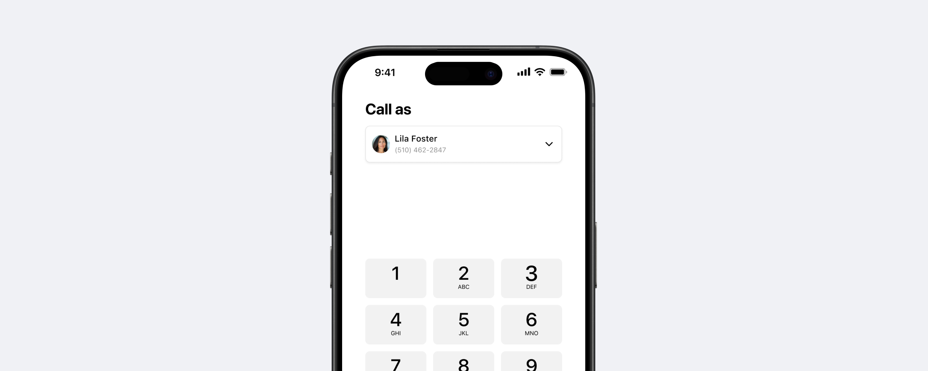
Dual-selector at the top of the keypad
The "Call as" area now shows two independent, tappable rows: identity on top, number below. A tap on either opens a bottom sheet with the available options. Before, a single dropdown mixed both concepts without clear hierarchy.
Bottom sheet with visual hierarchy
We evaluated dropdown, segmented control, and bottom sheet patterns. The bottom sheet won for scalability — it handles long identity lists without breaking the keypad layout — and because it follows native iOS and Android patterns for complex selections.
"Block Caller ID" relocated to where it belongs
It was nested under Target (identity), which was conceptually wrong. Moved under Caller ID, where it semantically belongs. A small change that removed a real source of confusion.
Contextual Paste button
If the clipboard contains a phone number, a Paste button appears on the keypad. If not, it stays hidden. No noise, no empty states.
Final design — Caller ID selector on iOS
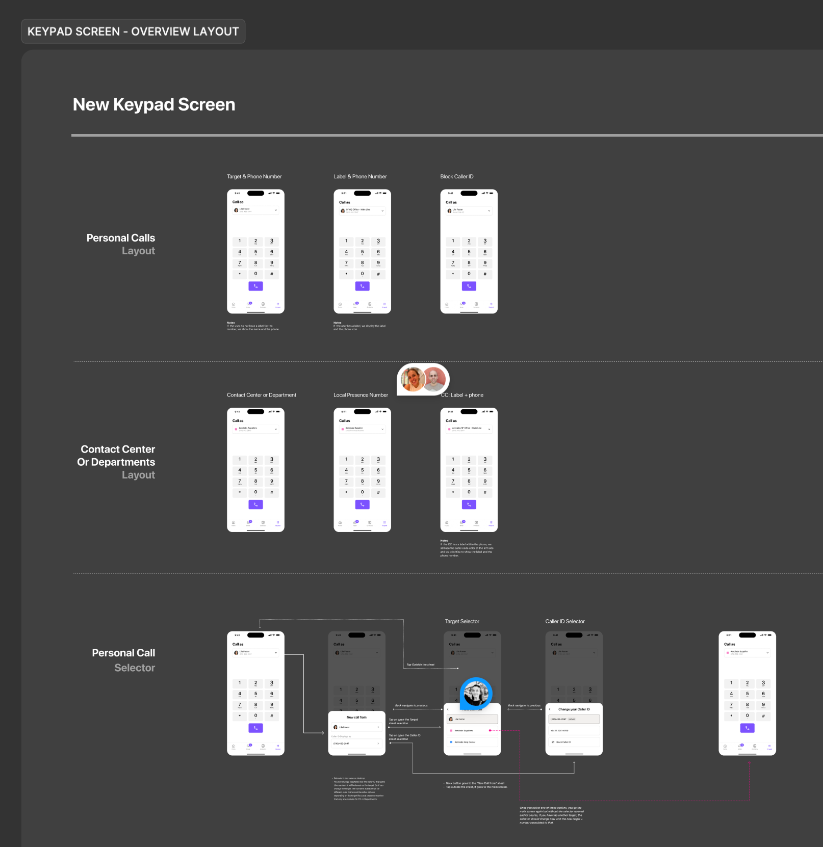
Engineering handoff — keypad screen layout breakdown by user type: personal calls, contact center, and department lines
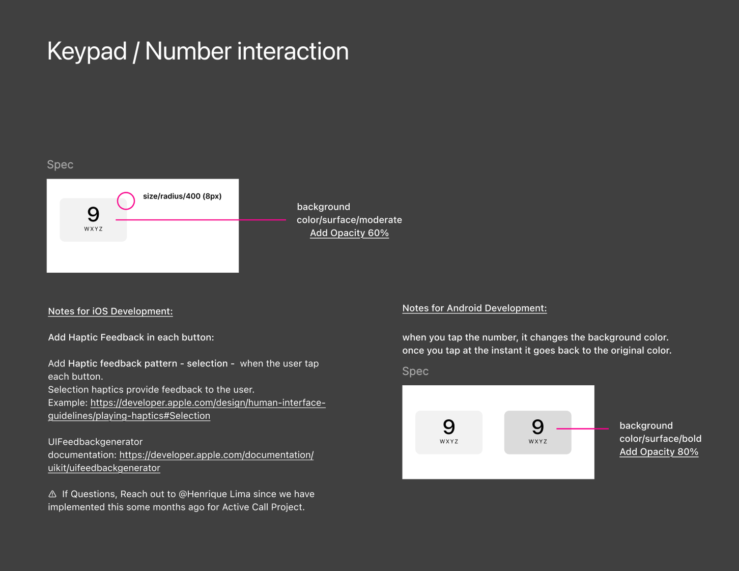
Engineering handoff — keypad number interaction specs: haptic feedback patterns, background color transitions, and platform-specific notes for iOS and Android
Caller ID selection went from accidental to intentional
Post-launch Amplitude data confirmed the core design decision: users change Caller ID in context, right before a call — not proactively from Settings. More importantly, the act of selecting a Caller ID is now deliberate: 65K+ selections/month, with over half going to call center lines — the segment most affected by the original confusion.
"Absolutely loving the new iOS mobile improvements you guys rolled out last week. The changes are noticeable and the usability has improved drastically. Huge kudos to the team."
Learnings
The real problem wasn't the UI — it was the confusion underneath it
Early on it was easy to frame this as a keypad redesign. But the actual problem was that users didn't know what they were selecting or why it mattered. Slowing down to understand that gap — not just redesign the surface — changed how we framed every decision. The UI followed from clarity about the problem, not the other way around.
Small prototypes, fast feedback loops
Recording short interaction videos — even rough ones — made it much easier to validate quickly with the team and internal users. Usability issues that wouldn't show up in a static Figma frame became obvious the moment something moved. It became a core part of how I worked through this project.
Designing for one platform is never enough
The solution had to work on iOS, Android, iPad, and Android tablets — each with different screen sizes and interaction patterns. That constraint pushed the design toward something more considered and resilient. Some of the strongest decisions came directly from solving for the hardest device, not the easiest.